Reimagining a Data Management Module by Harmonizing Existing and New Features.
Reorganizing a fragmented system to improve usability without compromising functionality.
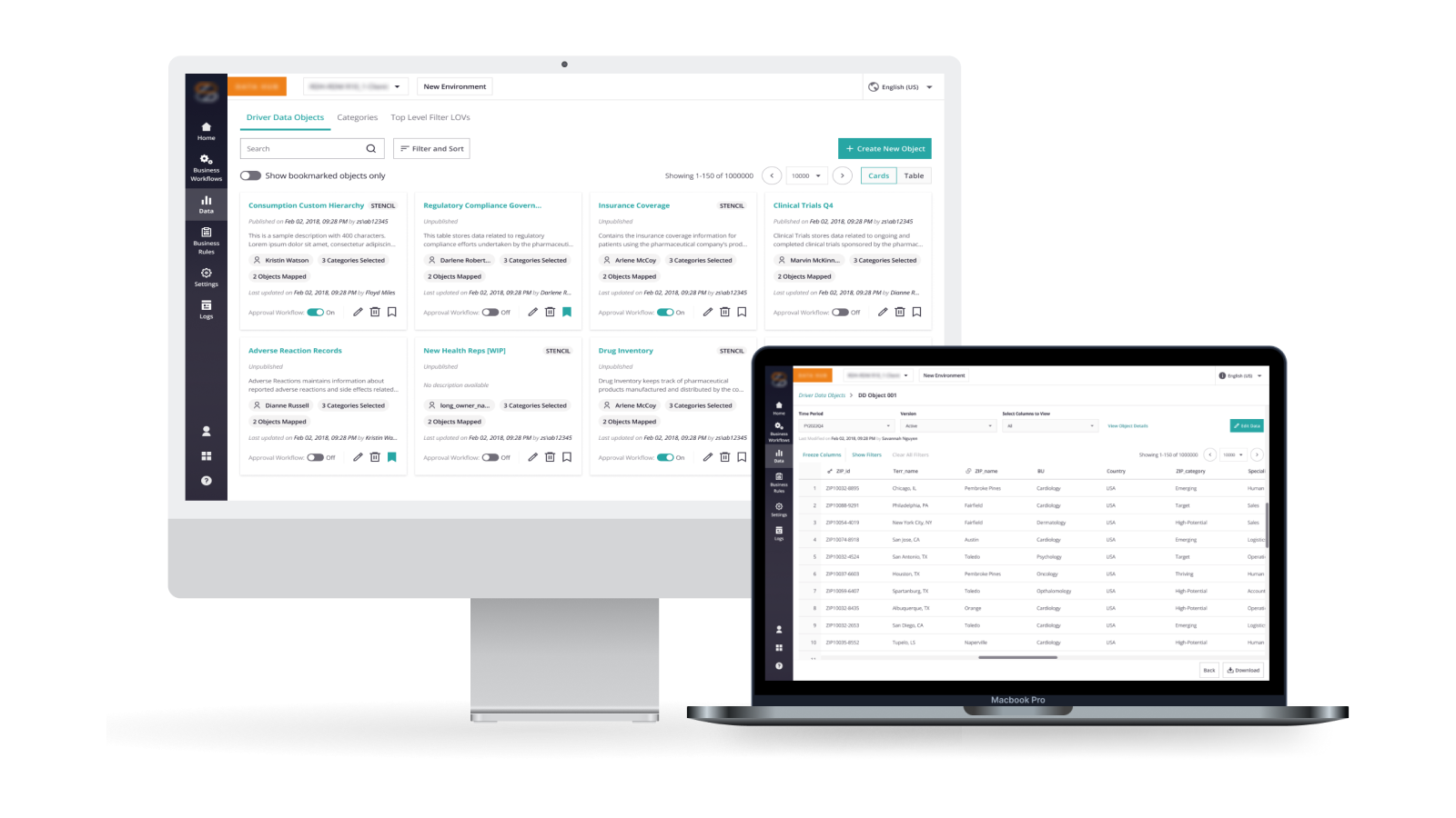
Focus: Driver Data is an essential module of ZAIDYN™ Data Hub, enabling users to manage frequently updated datasets that support downstream analysis and decision-making.
In response to a client request for additional features, the team undertook a redesign of the module. Over time, repeated feature additions had led to a fragmented and complex experience.
This project focused on reimagining the module’s structure and interactions to better support user workflows while improving clarity and efficiency.
Company
ZS Associates
Product
ZAIDYN™ Data Hub
Role
Senior UX Designer
Timeline
~3 months (2023)
Executive Summary.
A critical data module had become fragmented due to years of feature additions, resulting in a complex and less user-friendly experience. At the same time, the team was expected to introduce additional features, further increasing the risk of compounding this complexity.
The Reframing
Instead of layering additional features onto an already
complex UI, the problem was approached as an opportunity to
bring structure and coherence to the
system.
The redesign focused on harmonizing
existing and new features, reorganizing the module into
clearer interaction patterns, and improving the visibility
of key system behaviors such as validation and approvals.
Outcome
Post-implementation, the redesign resulted in a
33% reduction in task completion time,
reducing it from 15 minutes to 5 minutes.
The
improved structure and clarity also reduced friction in
workflows and made it easier for users to interact with and
understand the system.
Product Context.
Over three years, continuous feature additions resulted in a disjointed interface often described internally as a “Design Frankenstein”.
While each feature addressed a specific need, they were introduced without a cohesive structure, making the module increasingly complex and difficult to navigate.
The system struggled to support its primary use case of managing large datasets efficiently. Users faced challenges in understanding system behavior, locating relevant actions, and completing tasks without unnecessary friction.
Key Pain Points:
- —Features added over time without a clear structural foundation
- —Poor visibility into system states such as validation, publishing, and approvals
- —Difficulty navigating and interacting with large datasets (100k–200k rows)
- —Important actions and information often hidden or disconnected from context
With additional features expected to be introduced, there was a clear risk of further compounding this complexity.
Challenge.
Scale and Performance
The system needed to handle large datasets (up to 200k rows), making system performance and efficient interaction with data critical.
Feature Accumulation
Over time, multiple features were added to address specific needs, but without a unified structure. This resulted in a fragmented system where interactions lacked consistency and clarity.
Workflow Dependencies
Editing was tightly coupled with approval workflows, object locking, and validation layers, limiting how users could interact with the system.
System Visibility
Critical processes such as validation checks and publishing states were not clearly surfaced, making system behavior difficult to understand.
Role & Ownership.
I worked as a designer on this project, contributing across discovery, problem framing, and solution design.
I synthesized insights from user research, client requirements, and system constraints to define a more structured approach to the module. I led the design of key experiences, including the landing page, object-level interactions, and editing workflows.
I collaborated closely with product managers and engineers to align design decisions with approval workflows, validation systems, and performance constraints. The designs were iterated through usability testing, stakeholder feedback, and feasibility discussions.
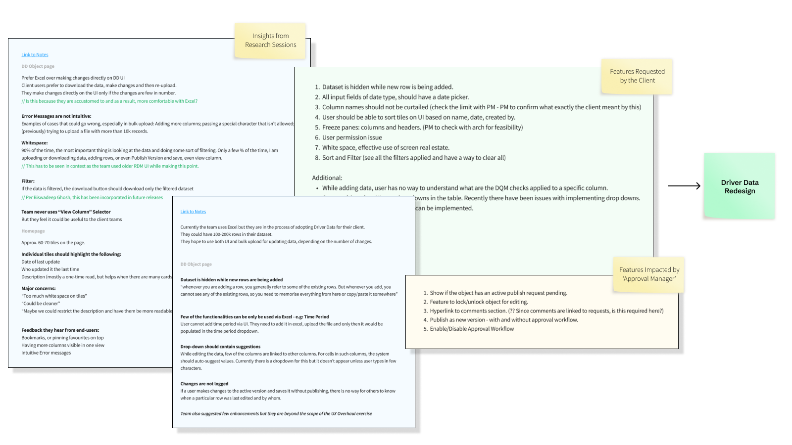
The Process.
We synthesized inputs from multiple sources including support tickets, usability observations, and internal stakeholder feedback.
-
01 / Context
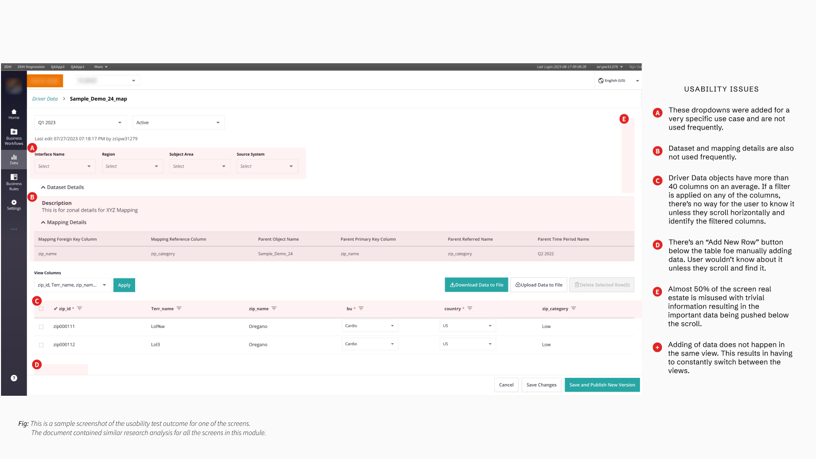
Loss of context: Key actions like adding data required switching views, disrupting workflows.
-
02 / Visibility
Invisible system behavior: Validation rules and publishing states were hidden, reducing trust.
-
03 / Density
Poor data visibility: Filters were hard to track, especially across wide tables with 40+ columns.
-
04 / Space
Wasted interface space: Nearly half the screen was occupied by low-value information.
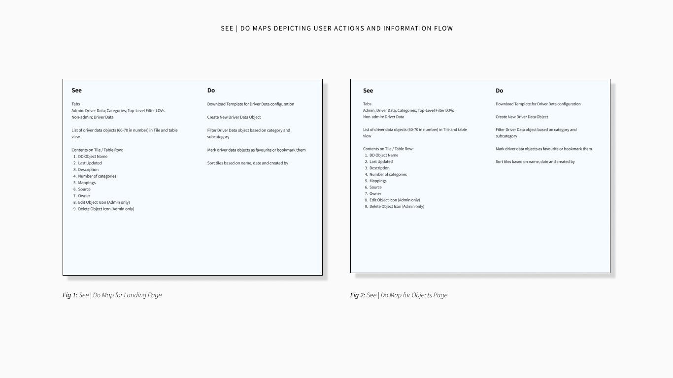
To better understand how users interact with the system at scale, we mapped what users see and do across key workflows.
Key Decisions & Trade-offs.
Introducing Structure and Interaction Clarity
Decision: Reorganize the module into a structured experience with a dedicated landing view for managing objects and an object-level view for interacting with datasets.
Why: The system had evolved without a clear structure, making navigation difficult and interactions unclear. Users struggled to distinguish between viewing and modifying data, leading to confusion and inefficiency.
Trade-off: Introducing additional layers and modes added additional steps to the interaction, but improved clarity, predictability, and scalability.
Prioritizing Data Over Supporting Information
Decision: Move secondary information such as dataset and mapping details out of the primary view to prioritize the data table.
Why: Important data was being pushed below the fold due to low-value information occupying prime screen space.
Trade-off: Some information became less visible, but the primary workflow became significantly clearer and more efficient.
Making System Behavior Visible
Decision: Surface system states such as validation, approvals, and publishing status within the interface.
Why: Users lacked visibility into critical processes, leading to confusion and reduced trust.
Trade-off: Added interface elements increased visual density, but improved transparency and user confidence.
Final Solution.
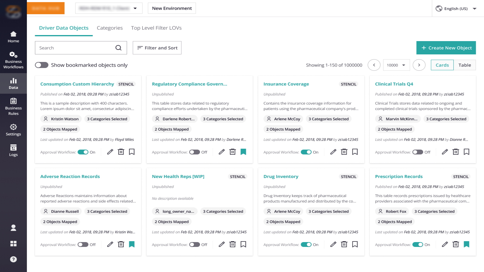
Reimagined Landing Experience
Introduced a structured card-based layout with bookmarking, advanced sorting, and improved metadata visibility.
Result: Faster navigation and reduced cognitive overhead when managing multiple data objects.
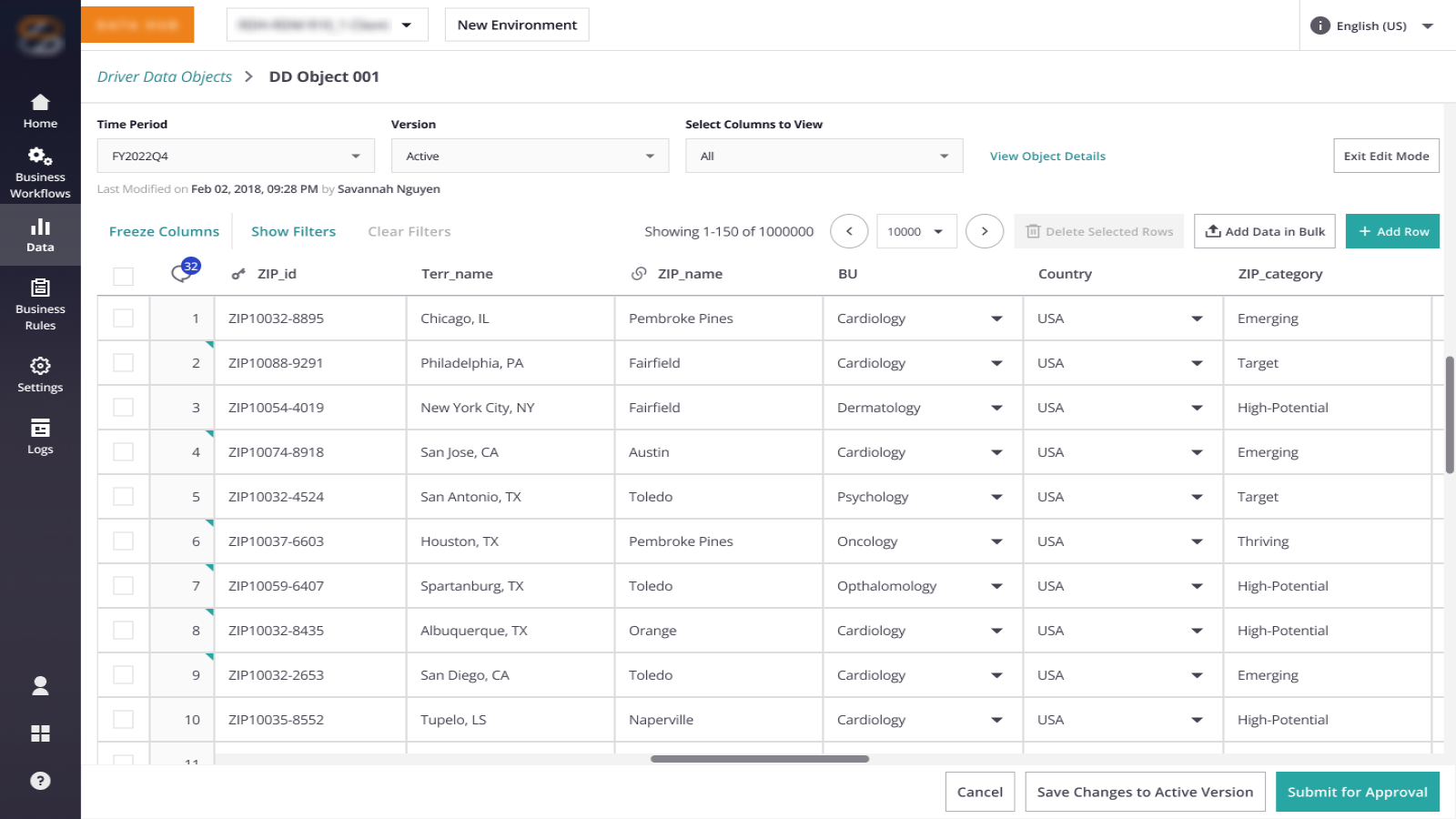
Contextual Data Interaction (Edit Mode)
A dedicated edit mode with persistent actions, inline editing, and column freezing for large datasets.
Result: The UI becomes a viable workspace for interacting with large datasets.
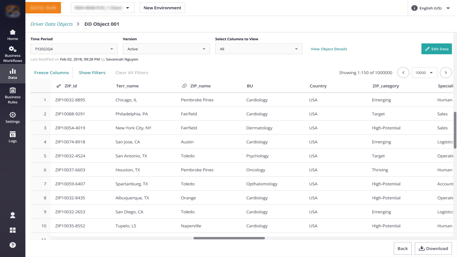
Optimized Read-Only Experience
Separated viewing from editing, prioritizing space for data over metadata and enabling efficient scanning at scale.
Result: Users can efficiently scan, validate, and understand data at scale.
System Transparency
Exposed validation, publishing, and approval states directly within the interface with improved error messaging.
Result: Increased trust and reduced ambiguity in workflows.
Outcomes & Impact.
Reflection.
This project reinforced that in data-heavy systems, clarity of system behavior matters more than interface simplicity. Identifying the “Design Frankenstein” early on allowed us to advocate for a deeper architectural shift rather than applying more UI band-aids.